A minor customization to a favorite font, attempted with Astra. Will Astra succeed?
Sep. 19, 2026
Pixel Operator (the libre/FOSS font used on this site) is one of my favorite fonts.
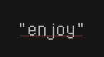
However, after embedding it on this site, a friend gave me feedback that the lowercase "j" glyph felt weirdly spaced against the characters adjacent to it.
The harmonized result.
For a quick, satisfying, resolution-- here is the before and after.
2x
original "j"→
2x
modified "j"
The new "j" settles snugly between its neighbors.
A quick but fun fix, and a good opportunity to give Astra a strange request and see what Astra came up with.
For the sake of good writing, I won't spoil if Astra made this beautiful "j", or if I did.
I looked at other monospace fonts for fixes. SF Mono uses a trick where an extra horizontal arm added to the top of the "j" can help rebalance.
I asked Astra to make the required changes, because learning the basics of FontForge-- a pretty old FOSS font editor-- would be more effortful.
One-shot attempt with Astra.
Prompt: Edit PixelOperator.ttf and add a horizontal arm to the top of the lowercase "j" glyph, below the dot.
This arm is meant to balance the horizontal spacing against the characters adjacent to the glyph.
Keep that in mind while editing.
2x
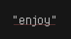
Astra's 1st "j"
This attempt is.. terrible!
I was extra disappointed because Astra was setting up a feedback loop rendering/editing the glyph via Python, but it was just a deceiving token-spasm.
I refused to let my ego ruin this lowercase "j", so I gave Astra a more open-ended prompt and tried again.
Open-ended, one-shot attempt with Astra.
Prompt: Please download the PixelOperator font from GitHub and change the lowercase "j" glyph, so it appears more beautiful and balanced against adjacent characers.
2x
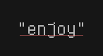
Astra's 2nd "j"
Even though this looks okay, it doesn't really achieve the goal of harmonizing the "j" with its neighbors-- if anything, it is now even more biased towards the right.
However, it does look more proportional and pleasing than the original glyph.
A lesson learned, Astra may produce better results with more ambiguous, poetic prompts.
This modest attempt by Astra inspired me to download FontForge and do it myself.
The final glyph, hand-edited via FontForge.
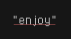
A hand-edit with FontForge yielded this.
2x
original "j"→
2x
my "j"
The horizontal arm draws more of the glyph's weight towards the left, balancing it against its neighbors. The lower stem was also straightened, with the same intent.
I bet that I could have made a similar change with Astra only given enough time, but sometimes ideas are hard to put into words.
One day, Astra will replace me. For now, I am awesome, and Astra is my friend.